Wednesday, February 29, 2012

Animated Triangle Entrance


So as promised I made a flash animation of the triangles appearing ingame. Today in class hopefully it can get cleaned up (get rid of the white in the background to make it transparent, i'm useless in After Effects) and implemented. Fortunately I made it so the triangles don't need to spawn pointing a certain way.

(Click the box to play the animation )

Tuesday, February 28, 2012

Visual Information and Feedback

From the playtests, I noticed that many people don't easily understand what the avatar's mechanics are.

So I've been toying with different visual cues to relay more clear information to the player.

Some didn't realize that the pink aim point is actually where the gravity pulls the blocks to, and the avatar is where the pushing force comes from. So I emphasized the aim point and added an outward "distortion" particle emitter from the avatar when the player clicks.

http://youtu.be/8Bs354g9kzo an example of what I've been working on.

Always open for your opinions,

Nate

Updated survey

http://www.zoomerang.com/Survey/WEB22EXPB2B3V6

Sorry the last survey I was using didn't give as much control over the results as we would have preferred. I didn't use other sites before because they had a cap of 10 questions. I kind of found a way around this by lumping all the optional responses that require written answers together.

I strongly encourage taking some notes while they're playing or asking them these and other questions anyway and recording their responses if you can, otherwise they can enter them on their own. But in general most of the feedback I got was from me simply observing them play.

Monday, February 27, 2012

Playtests and Progress

I haven't had anyone take the playtest yet because I wanted to wait for a new build and i wasn't sure it had been swapped but i have people lined up to play after today.

For Progress i got sound effects done and got back some of the revised music from my composer including a um....."marching" number......BWAH HAH HAH HAH HA!!!!!

Anyway hoping to get those in as soon as possible.
I read the results from Eric's play tests and it seems like we got some useful feedback to work with.

I have 4-5 play tests scheduled for after class today, so I will post those results later.

Sunday, February 26, 2012

General play test comments from eric

Hey I haven't had a chance to review the results of all of my play test but I conducted around 8-10 (looks like only 7 completed the survey) and these are some general themes I noticed while just observing people play.


  • Players took a while to get through the second part, but the time spent there was essential to their success in the final part, otherwise they took much longer to meet goals
  • They were unsure if they were damaging the boss
  • They clicked too much, relating to not understanding how firing actually worked
  • Didn't seem to get that the pink dot helped aim a directional blast (either forgot the direction in instructions or just didn't notice it)
  • They moved around too much, too fast most of the time to maintain blocks (only a couple played the game well, aiming etc, waiting to gather blocks), 
  • Only one or two got aiming without being told. Telling the experienced gamers to slow down and watched what happens allowed them to realize how to gather blocks (it might be helpful to adjust the speed of gravity so its more significant during casual play). 
  • After being told the dot aims or to slow down to accumulate a grasp on blocks, about half of them got the mechanic with two practices, the others reverted to excessive, reckless clicking
  • few read all of the directions without being told more than once they needed to do so before playing, players who read all directions generally played much better than those who skimmed (would be helpful to have better visual ques without these directions)
  • most players asked how to do essential actions after beginning (absorbing blocks, most forgot about releasing blocks
  • less than half noticed the growth when absorbing blocks or shrinking when pressing L (and most only noticed it after enemy attack/gameplay was at a slower pace during the second square)
  • about a 1/3 of players released too many blocks and killed themselves lol
I'll update with more comments after I review the results. If you want to take a look at comments yourself you can download the PDF results from here.

Saturday, February 25, 2012

My survey results

I got two play testers. Here's the jist of what they said suggestion-wise

Make the enemies more challenging. Right now they're not really a threat unless you're an idiot
User feedback that indicates the player is increasing in size, because at least one of them didn't notice until I told them.
The player needs an intuitive goal.

There is a bug where the player would get stuck on occasion, particularly when they tried moving around with a moderately big pile of blocks.

My Observations
-Player moves too damn quickly. Once you become too big, you can't control yourself. I would revert it back to the way it was where the player, no matter the size, moves at a set speed
-Put more blocks in the game and remove size limits. The pre-alpha iterations where we were running around creating Planet [Insert Your Name Here]s were fun, this just seems kind of...bleh.
-Players are gonna make the mistake of absorbing all the blocks in level 2, and the L-key regurgitate block function isn't intuitive at all. Forcing them to restart seems too much like a punishment. I don't know how to balance this, but we can discuss this on Monday
-Using The Force (that is, throwing a cloud of cubes at triangles without exploding them) is still a viable option, as is sitting in a corner in a cloud of cubes. One suggestion I would make is re-code cube/triangle interaction so they don't at all collide UNLESS the cube is going at least X speed. However that's probably gonna cause problems since there's gonna be dozens of checks going on constantly as triangles inadvertently bump into cubes harmlessly. If it doesn't outright murder FPS, it has the potential to cause problems.

My Plans
-Hassle the programmers art-wise :P
-Remix some sound effects and music to either give us some audio variety or something I think will blend in more effectively with the motif.
-Learn how to get audio-editing software to work.

Friday, February 24, 2012

Bug reports

This blog post will be used to track bugs, please list the build/version number in the description.

NOTE: I'LL DELETE COMMENTS WHEN THE BUG HAS BEEN ADDRESSED (just to keep it organized, if a bug reoccurs, repost it this way I know it's reoccurring) . - David

New build changes (v14)

Bug Fixes:
-Fixed no damage bug
-Fixed no sound bug

Gameplay tweaks:
-increased gravity power
-increased radius from aim point for snipe effect
-reduced number of cubes in triangle
-Level 2 has up to 2 enemies at any time, spawn time is longer.
-player is slower, acceleration is unchanged

Added:
-level 4 state, as trigger for meta circle appearance (absorb 5 cubes after entering triangle, some enemies will spawn during level 3)

Survey ready!

(Old link removed)


new one is: http://www.zoomerang.com/Survey/WEB22EXPB2B3V6


Dave got the latest version on Perforce. I exported builds, uploaded them, and created links in the survey. I noticed that the game pace changes when video settings are altered for the downloads so I disabled changing the video options before building. I also found out if you full screen the web version all the controls work but it runs a little slower then the desktop versions. 

I would say try to get people to do the downloads but I made the web version available still because for a few of the people I had to get to play it remotely, they failed at unzipping anything lol

I did add a question to signify which version was played though so we can account for the pace of the game in their answers.

****Also, I'd try to keep this playtest sample of new players small or feed it to those who will help us do repeat tests anyway. I'm still not sure if there's some end or restart function in the game and theres a bug that stops the player from moving once they're too big.

Thursday, February 23, 2012

Lastest survey

Hey everybody,

So I revised or combined questions in the survey, it's down to like 12 and it's like half comment, half rating scale or choice with comment options.

We still have to export the last build before I can attach links so we'll have to sit tight for a bit before we can start actually doing the play tests.

In the meantime, take a look and email or post a comment here if you think something should be added or changed. I took out most of the silly questions haha, the first use was mostly to help gauge demographic.

Gameplay mechanic ideas

Using this to track gameplay changes through comments/requests (changes in speed, reduce number of cubes, change enemy speed, etc)

Tuesday, February 21, 2012

New build changes

Changes for the new build
==================================================================
Gameplay:
==================================================================
Try these out and see what tweaks we need, also these will mess up the balance again (but that's ok as we're working on new waves system anyway)

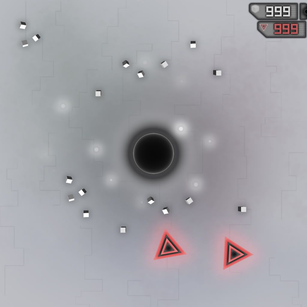
-New blast forces, if aim cursor (pink dot) is far away from player, you get a powerful and precise shot with less spread, if it's close you get a lot of spread and normal power. Scales linearly based on distance from player: i.e. Max distance away is pretty much all a directional blast (powerful cube blob), cursor directly on the player is all spread blast.

The directional "snipe" only effects cubes within 10 units of the aim point, the other cubes get a proportionally weak spread blast. However in large cube blobs the cubes at the center get the powerful blast, but the ones in front of them may not and slow them down. Trying to work on that. May drastically increase the force.

Also need to consider visual feedback for the player, probably through the aim cursor size/color

-Timer before gravity kicks in after a blast reduced a lot, however haven't added player control over this as it seems like more complexity with little use. We can discuss whether it's useful enough to add another control, personally I haven't found any compelling uses for it yet.

-Player speed and acceleration now increase with size

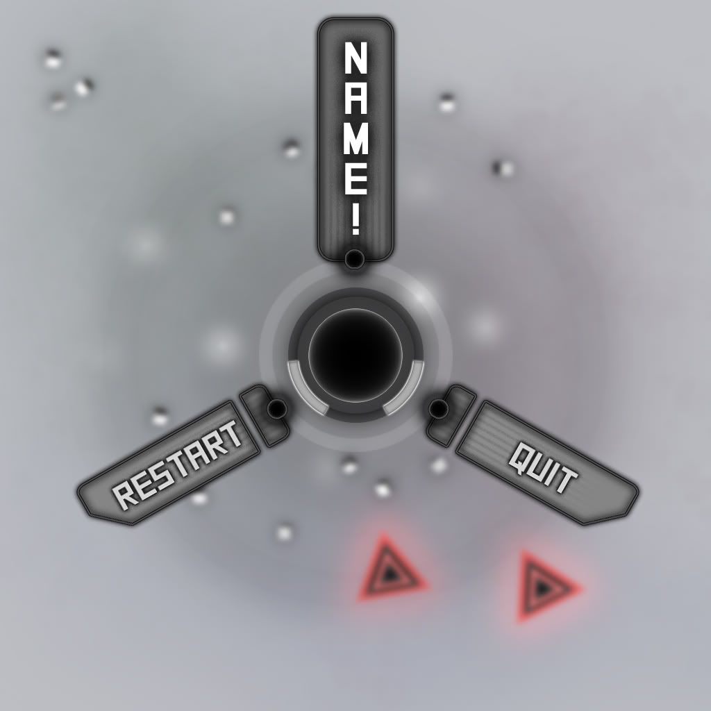
-player can die, restarting the level (needs lots of balancing)

-Triangle enemies do more damage, are faster, and a little harder to kill

-Aim cursor can be a lot farther from the player, for smoother control of force, but putting it really far away can make it have to swing around.

-Zero sum cube system, when hit you drop cubes (at the moment just dropped). Also tap 'L' to drop cubes. Holding it down doesn't work, as a safeguard against dropping too many.

-meta-circle is now killable (needs user feedback)


==================================================================
Art
==================================================================

-Added procedural lines

Monday, February 20, 2012

Another week another progression

Progression for the week:

Made star destory (cue evil laugh!), got my composers to give me another two songs for the game, will make some changes to them to have them better suit the game.

Updated Survey

I'm having a little trouble completing the survey from an iPad but I hope to have it up soon to coincide with the next round of playtests.

I'm trying to find a survey building that will allow me to attach image tags or pics so we can get some feedback on the art too.

I'll post the link here when it's done.

Sunday, February 19, 2012

Major/Minor design problem

So I was looking at the alpha video again when something major occurred to me, and i'm still beating myself over why I didn't notice it sooner. One fundamental problem I noticed with our current rendition, the background is Navy colored, not black.

I'll talk more about this on Monday. I can't imagine it's something that's difficult to fix, but I think it's gonna have a major effect on the visual design.

Wednesday, February 15, 2012

UI Designs

So after I noticed that the current rendition of the UI design (there was unanimous consent, even from me that it looked good after Sunday) looked like crap in the actual game, I went to work fixing it up. Per suggestions, I made an additional iteration. The current plan is for Dave to put them ingame and get a screenshot so we can decide.

The Resume button is the original style. Out of all of these this is the one I want to see the least because I already know it doesn't look good ingame

The Exit button moves significantly closer to my style, and uses strong green glows to contrast against the solid black. Since there's unanimous support towards moving into a more glowey art style, this one will blend in very well with that. My personal favorite, though I won't fall on my sword on it.

The first Restart button is the first iteration of a more sleek, sharp design that moves away from glows, and more towards my old retro style. I like this a lot, especially considering that I plan for the buttons to be emphasized with some sort of effect when the player's cursor has a button selected. A button in this style with a bright green glow will easily stand out.

The second Restart button uses a darker background with more contrast than the original as per Dave's suggestions. Personally I like it better than the prior iteration and it has all of the same benefits of the sharp design.

Monday, February 13, 2012

Alpha video

Alpha vid:

Untitled from D Bayzer on Vimeo.

Progress...again

Basically for the last week i've been working on getting stuff ready for the alpha build. Been playtesting to tweak the mechanics. Been helping focus the art design and looking up sound effects and background sounds.

Saturday, February 11, 2012

Concept mk II stylized

Went and photoshopped a bit more stylized in plack and green. UI menu layout is the same (mostly since I haven't had time to try some other layouts).

background is lines, cloudy, and some fain hexagons on a dark blueish, so that the character is noticeably darker. Included some mockups of exploding and aiming.

I think you can just go to the album, better than a bunch of links.
http://s1067.photobucket.com/albums/u431/david_bucket1/

Friday, February 10, 2012

Concept Idea MKII


Building off of some of Nate's idea, I refined a bit of the UI interface to improve off of some of his shapes and designs into the (totally not just my opinion but verifiable fact :3) more crisp black and green original design.

The first major change is the player avatar becomes a black hole. Because everything else is black, a white corona halos the avatar. Not only making it stand out through shape alone but in color as well. Personally I think it looks really badass, but of course this too is verifiable fact :) There is no such thing as too eclipse-ey. If the corona could like...move around somehow, that would be fantastic

Second, this concept is of a pause screen, possibly a title screen. because it's all black and green, i've darkened everything except the UI and player avatar to prevent blending. The 4 buttons should be pretty self-explanatory (although in a 'one minute of awesomeness' game, I don't see why we need a save-load function.) Furthermore, to emphasize what the player has selected, I put a dirty glow around one of the buttons and the text.

I wouldn't mind the diamond connecting the buttons being removed, i'm not it's biggest fan, but a circle looks out of place and a square looks just plain silly. The font is a placeholder, though I could see it in the final beta.

Anyways, any sort of details aesthetic-wise should be ironed out by Saturday.

Wednesday, February 8, 2012

Abstract concepts

Tried a few more out there ideas to see what it would look like, going off the idea of a more black hole look mentioned in the feedback feedback (would be done ingame with a black sphere, and a 2d sprite slightly below it showing the ground being sucked down effect as it's just some photoshop trickery and the player always views things top down). Should look like you're controlling a hole in the level.

However to have a black hole/dark colored player, the black background had to go and I did a more abstract grey digital look, with faint clouds of color splatter in the background (giving it some depth and something for you to see you're movement relative too (more sense of speed).

Also make use of a minimal/soft/color splash look. Sort of a soft digital with lots of glow.

I did versions with the plain background and a refined mockup of my menu layout idea. Also versions with Sam's background converted to black (this can be done in photoshop batch process to convert all the drawings, so it is doable). They are faint, but would be much more noticeable when moving.

Glowing dots around the player show powers, suck in towards player when using gravity pull and fly out when exploding (only live for a couple seconds, like bullets). Would be a 2d particle effect with no physics. They could also show range by spawning near the edge of your range.

Basic

Menu


With Sam's Background

Tuesday, February 7, 2012

Concept idea

So guys, check this out. Better visualization of what I have in mind for a UI. The background is partially masked by an opaque floor in the arena. The concern was the green 255 background would blend with the green 255 everything else, and I had anticipated that already, hence this. The edge is 255 green and very thick so it stands out. Similarly, the powerups are green, but stand out by their size and shape as well as their color (because they're clearly not enemies.)
Enemies will cycle through a bunch of colors, occasionally flickering (that is, dissapearing for a frame or two and appearing back) or giving off some cool special effect to give the player the idea that they aren't supposed to be there.

The current UI is basic, but I like the idea of keeping it a simple black and green box on the top right of the screen. The counter on the left counts enemies, the one on the right, blocks. I was thinking of using the LCD Digital font you see on old VCRs or digital clocks, however this placeholder could work. Icons give the player visual clues as to what the counter counts. Because flickering enemy icons would be disorienting, it should be a static red.

Currently the idea of powerups having unique shapes such as triangle pyramids or dodecahedrons is popular, though there is sentiment about changing its color so they stand out. The current concept art shows them in green just to see if shape and size alone is enough to get them to stand out. I did a bit of experimentation and I think Red 0 Blue 128 Green 200 would look best for powerups if we cannot have green 255.

Questions? Comments? Critique? (TOTALLY my line by the way, that other group stole it from me! >:( )

Fun fun fun

Hey guys,

First I would like apologize for not being in class yesterday, I wasn’t feeling too well.

I was talking to Todd in our Capstone class and he reminded me that Alpha build is coming up very soon and there’s plenty of work to do. So I wanted to try and add some more structure to this process so we can all be sure we are working toward the same goal. Below I’ve jotted down some pieces of the puzzle that still need to be put into place.

Also, I wasn’t there yesterday so I’m probably behind on some information. And please let me know if I’m forgetting things.

UI

Pre-game UI (splash screen, main menu, instructions/tutorial images?)

  • Design
  • Art
  • Implementation

In-game UI (score, health, minimap?, message displaying system)
  • Design
  • Art
  • Implementation


ART

Player character
  • Design
  • Art
  • Implementation

Junk
  • Design
  • Art
  • Implementation

Bullet
  • Design
  • Art
  • Implementation

Particle Effects (lots and lots)
  • Design
  • Art
  • Implementation


DESIGN

Primary Challenges (How do I advance to the next level? How does the player know what to do?)
  • Design
  • Art (if applicable)
  • Implementation

Secondary Challenges/Rewards (if applicable) (kill spawner to get a power-up)
  • Design
  • Art (if applicable)
  • Implementation

High-level Challenge (How do I win? Get to a certain size? Boss battle?)
  • Design
  • Art (if applicable)
  • Implementation


SOUND

Music (main menu, level)
  • Find clips
  • Implementation

Sound Effects
  • Find clips
  • Implementation

Monday, February 6, 2012

UI Mock up

This is a quick mockup of what I was talking about. Placement, rotation, and etc all could probably use some tweaking, but this is the basic idea.

Link

Feedback reports

Feedback reports compiled from playtests, please include the build version in your post when reporting.

Working on Survey and playtest feedback

Hey guys, reviewing more survey comments and revising the questions.

Some people thought there were too many questions so I want to make more rated questions to get the feedback we need and keep comment questions to a minimum.

I'll make another post on adjustments we might be able to make based on the rest of the feedback I read.

Did anyone else get people to play the first playtest? Any specific feedback already?


Progress and comment

been working on enemies, changing color and making sure they are like the triangle enemy. Also started searching for sound designers for help on music.

Sam's background looks great! It's interesting (lll). Can't wait to see it in game.

Sunday, February 5, 2012

Backgrounds, backgrounds, and other stuff

So the background is done. I have it sitting in my email, and in the interest of saving hard drive space i'm not downloading it to my computer to have it posted...yet. Some last-minute touches may need to be done. Mainly, adjust the speed of the video. But as-is, my goal was to create a looping animation in the background, and that is exactly what I did.

For the purposes of finding more things to do, I might look up some good light techno to put in the background and possibly other sound effects. Furthermore, I might make models of the bits you're supposed to collect. So far everyone likes the idea of keeping them as rotating cubes, but there's also talk of making different sized variants that do different things. So my current idea is to model other geometric 3-d shapes like dodecahedrons, triangle pyramids, etc. I wouldn't be suprised if the latter was thrown out because it might be too visually noisy, but I digress.

Blah blah blah, monday in class should get that background in pretty easily, as well as last-minute changes.

Saturday, February 4, 2012

Programmer update

Doing the usual, further improvements bringing us towards alpha functionality, incorperating play test feedback for gameflow, goals, and controls. SOme bug fixing if time allows, but I'm aiming at getting everytihng in at an alpha level before worrying about most of the bugs.

Wednesday, February 1, 2012

Sound Design

By now you've gotten Brians email about what we need for the alpha in two weeks.

For sound design we need to things: 1. Background Music for the game and possibly the splash screen. 2. Sound effects for the various enemies and actions in the game.

On Monday we need to discuss these so that we can move forward and get it done in time.

Daily Double Progress Report

This is a daily double progress report of my work on the game in the last two weeks..

Mainly for the last two weeks i've been working on levels, we've incorpated one into the game (just without collisions) and i'm working on the scaling for the other levels. I've been getting the other enemies ready after we successfully got the triangle enemy into the game.

For the playtest i got my roommates invovled and each participated in the survey. I've also contributed ideas about some of the results of the playtest such as having particle effect fly off the triangles when they go to ram the player, and suggesting some other particle attacks for the enemies.

Initial Playtest Report

The first play test was a rough one because of the game being in it's early stages. When observing the players, I noticed that most of them struggled to grasp the play mechanics completely for about the first two minutes. Most of them had an "Ah Hah" moment around the 2-3 minute mark and the remaining 2 minutes of time was spent trying to "beat" the level.

Common themes in negative feedback were: needs more art/style, exploding mechanic didn't always work (or they expected more to signify it), feeling unaccomplished because the enemies never stopped appearing and there was no advancement, being unclear on core play for too long, feeling gameplay was tedious.

Common themes in positive feedback included: When it worked seeing the exploding mechanic work at a fast pace, seeing the player object "grow", destroying the enemies. Although many players had the complained of their being no clear objective or hinted at frustration, we noticed that once core play was accomplished and learned, they proceeded to play more anyway.

Planned changes for future versions include:
    •    Swapping player and enemy objects/art to build player attachment or investment in roles
    •    Increase opportunity for length and information player discovers in tutorial section before enemies spawn, so they're not frustrate in the middle of action by new expectations
    •    Adjust art so stages in gameplay are clearly identifiable to player (blocks could be red in border to signify attack power, player could change color to hint at travel speed or current gravity, etc)
    •    Fix bug where gravity release does not always work
    •    Possible give players more control over their attack, or multiple methods for attack
    •    Create spawn points for junk
    •    Create spawn point objects for enemies
    •    Incorporate an identifiable goal for level advancement
    •    Try a version that Incorporates a switch into controls instead of current "hold to" mechanics
    •    Change or add an attack to give player more manipulation capabilities

Results of survey located here:
https://docs.google.com/spreadsheet/pub?key=0ApvsESNHKVh-dHFNX0twV2hENGNKX1haRnFOd2w0MFE&single=true&gid=0&output=html